VIEW

PAYAZA GIVE

The Collection Layer for a Global Contribution Platform.

Three friends laughing together

Accepted payment methods

PayGGoogle Paymastercard& more

That Question Sounds Simple. The Answer, Once You Start Pulling On It, Is Not.

Payaza Give started as a question rather than a feature request. What would it take for a content creator in Lagos, an NGO in Nairobi, a church in Accra, or a freelancer in Johannesburg to collect contributions from anywhere in the world, in any payment method, and receive the money in the currency they actually want?

207M
Influencers Worldwide
4.2M
Congregations Worldwide
10M
NGOs Globally
The IntroThe Start

Most contribution tooling available to creators and organisations was built for a different reality. Western nonprofits with US bank accounts, predictable currency rails, and donors who already trusted the payment surface. African fundraisers were stitching together Stripe workarounds, GoFundMe links that didn’t accept their region, and bank transfer instructions in Instagram bios that quietly killed conversion every time a donor had to leave the app to act. Payaza Give was designed to collapse that journey. One link, one branded page, every payment method a donor already trusts (Apple Pay, Google Pay, cards, local rails), and a settlement experience that lets the recipient choose the currency they want to be paid in.

This case study covers the collections side of the product. How contributions come in. A second part covers the trust and settlements layer. How the money gets out without breaking the regulatory contract.

The Landscape

The contribution economy is enormous and structurally underserved.

Roughly 4.2 million churches, over 10 million NGOs, and 127 to 300 million content creators worldwide. Charitable giving alone is projected to hit $930 billion in 2025. Every one of these segments needs to collect money from people in different countries, currencies, and payment cultures than their own.

But the tooling hasn’t caught up.

Donor audiences have gone global. A creator in São Paulo has followers in Berlin. An NGO in Manila runs campaigns funded from London. The collection tooling, mostly, is single-market. Apple Pay and Google Pay now dominate mobile checkout in the largest donor markets. Most contribution products still lead with card forms.

And the recipient side is fragmented. A creator, a school, a church, and an NGO have different brand, settlement, and compliance profiles. But they were all being served by the same generic checkout.

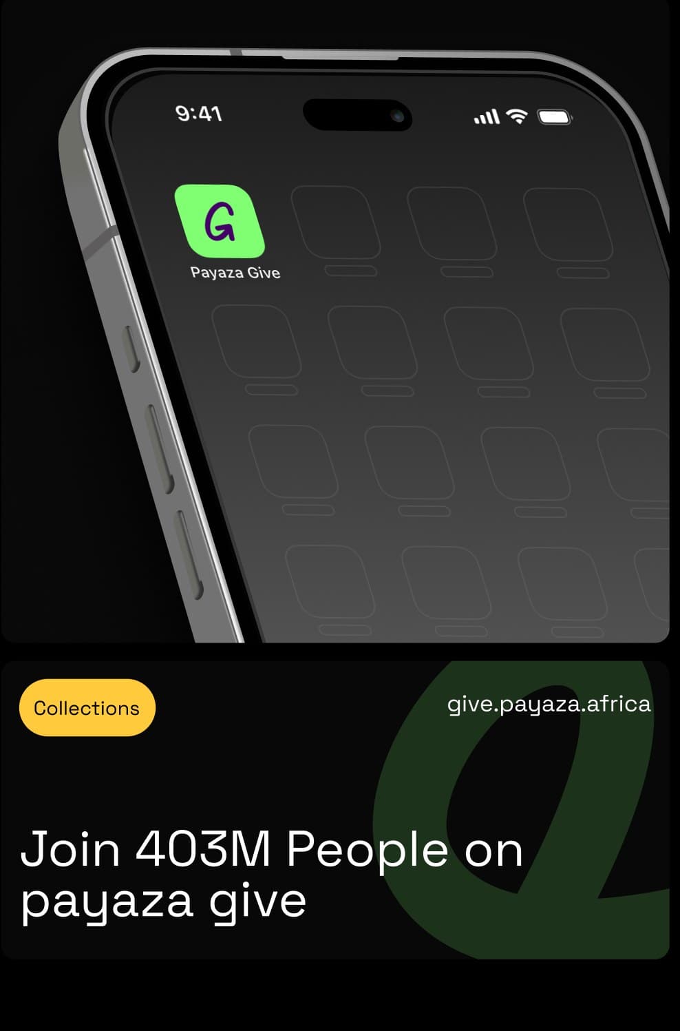
Payaza Give app icon on a phone home screen — give.payaza.africa
Research

The research ran on three tracks, each with a different method and a different question.

Comparative Checkout Teardown

We benchmarked the donor experience against eight products donors already used confidently. Apple Pay on retail, PayPal on creator platforms, Stripe-powered checkouts, Cash App, GoFundMe, Patreon, Buy Me a Coffee, and Ko-fi. Each was evaluated against a 12-point heuristic covering payment method visibility, field count, context switches, error recovery, latency, and trust signals.

The pattern was consistent. Donor completion correlated less with the donation category and more with checkout fundamentals from commerce. Wallet-first surfaces outperformed card-first surfaces. Single-context flows outperformed redirect flows. Inline validation outperformed page-level error states. The implication was that the right benchmark for contribution checkout was not other donation products. It was best-in-class consumer commerce.

Ps. This method: heuristic evaluation + funnel analysis across 8 reference products

Recipient JTBD Interviews+
Cross-Border Journey Mapping+
Goals

The product had to do three things well at the same time, and a fourth thing well enough not to break the others.

Maximise donor conversion across regions and payment methods. The benchmark wasn’t donation tooling. It was Apple Pay checkout on a well-designed e-commerce site.

Give recipients a branded surface they’d feel proud sharing. The product had to disappear into the recipient’s brand, not impose Payaza’s.

Enable currency choice at the point of payout. Recipients should settle in USD or their local currency without manual FX, and without buried settings.

Hold the compliance line without killing momentum. KYB shaped every collection decision, because it determined what was possible on day one.

Donor checkout completion rate
Benchmarked against best-in-class e-commerce checkout, not against donation industry averages, which are lower.
>95%
Target
Time from link creation to first contribution received
A creator who has just experienced a viral moment cannot wait for a 3-day verification cycle to start collecting.
15 Minutes
Target
% of contributions completed via Apple Pay / Google Pay
Wallet share is the cleanest signal that the checkout is matching donor expectations.
>40%
Target
% of recipients customising their page within 48 hours
A proxy for whether the branding layer feels valuable or feels like an afterthought.
>65%
Target

The Build

The build was organised around five decisions, each resolving a tension surfaced in research. Each decision sits alongside the design that operationalised it.

Decision 1:

Separate the right to receive from the right to settle

The first tension was between compliance and momentum. Regulated money movement requires KYB. KYB takes time. A creator in the middle of a viral moment does not have time.

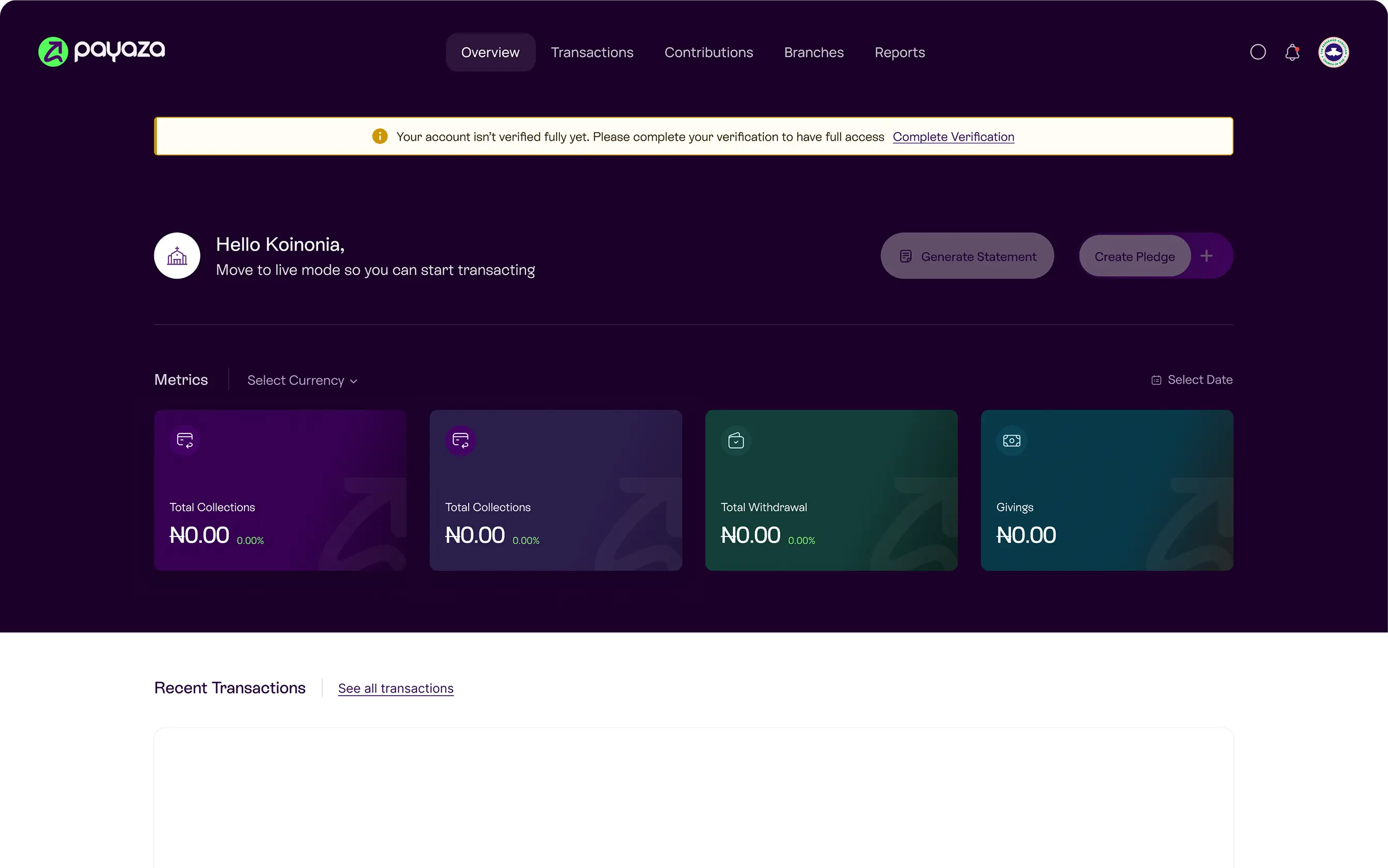
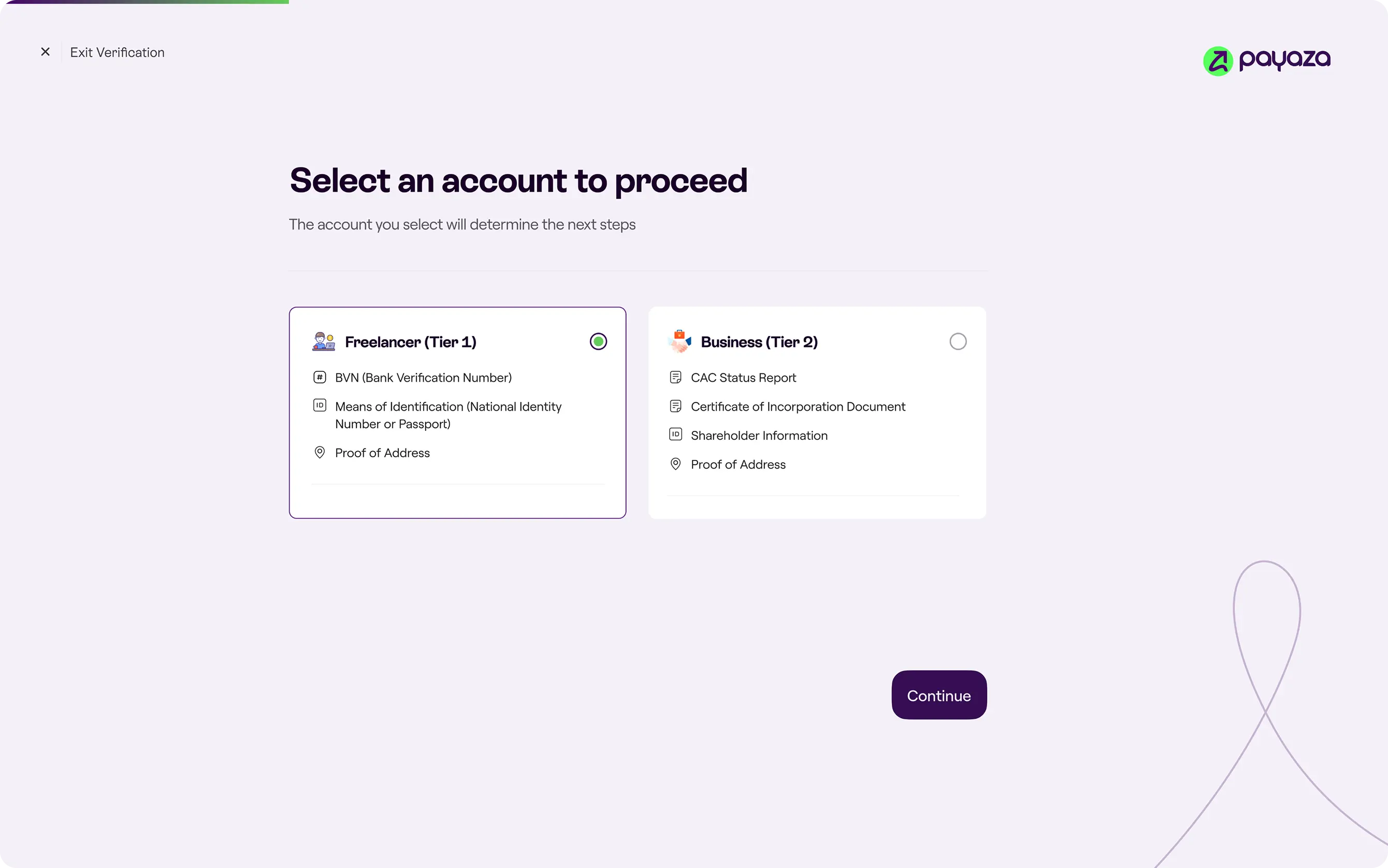
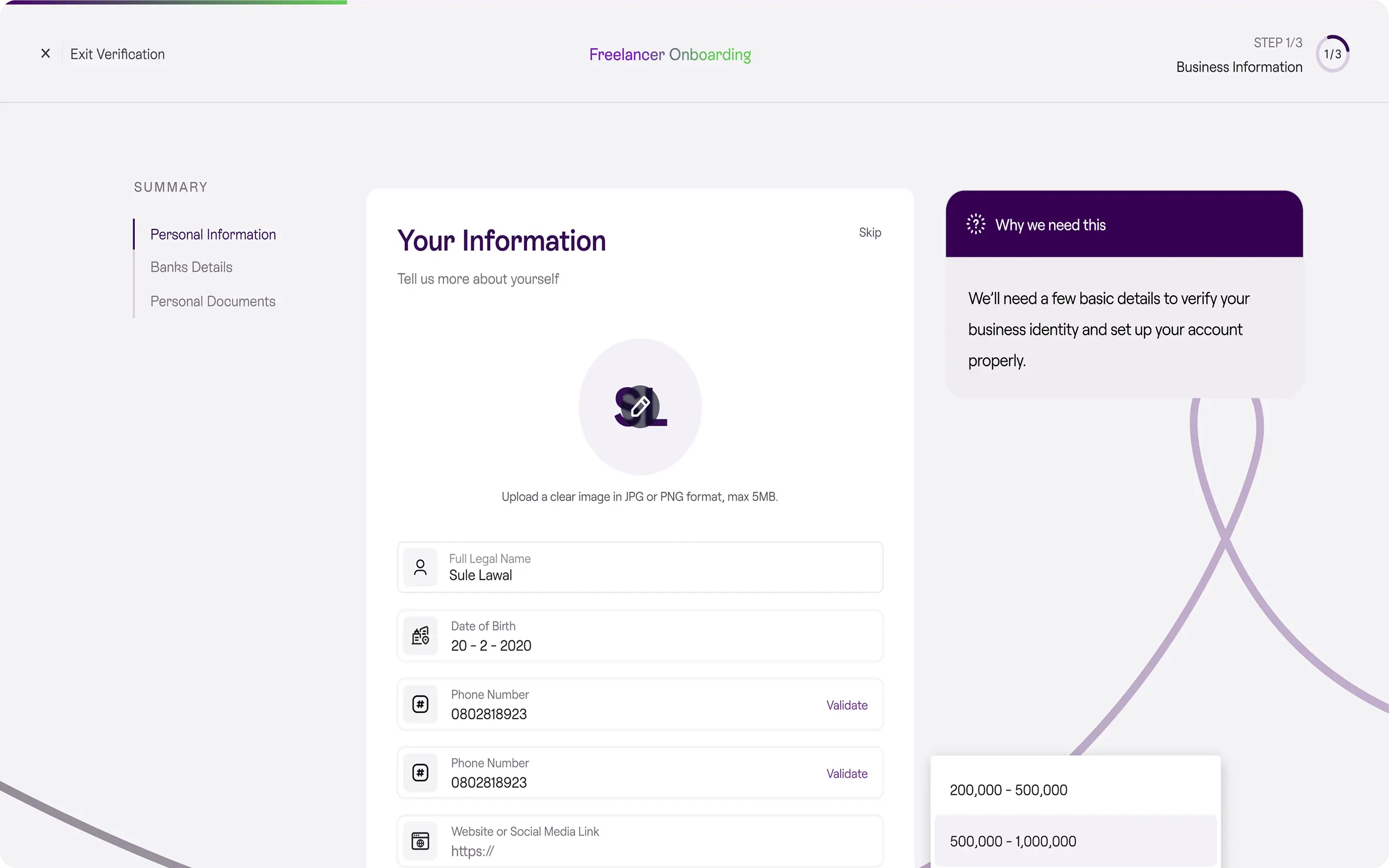
The decision was to decouple the two halves of a recipient’s lifecycle. A new user could create an account with only essential information and immediately generate a working contribution link. Funds collected during this window accrued in a held state. Settlement unlocked once KYB completed.

The tradeoff was operational. Holding funds adds reconciliation complexity and creates a state the support team has to be ready to explain. It was worth taking because time-to-live was the dominant variable for recipients, and any product that gated link generation behind KYB would lose them at the moment they were most ready to adopt it.

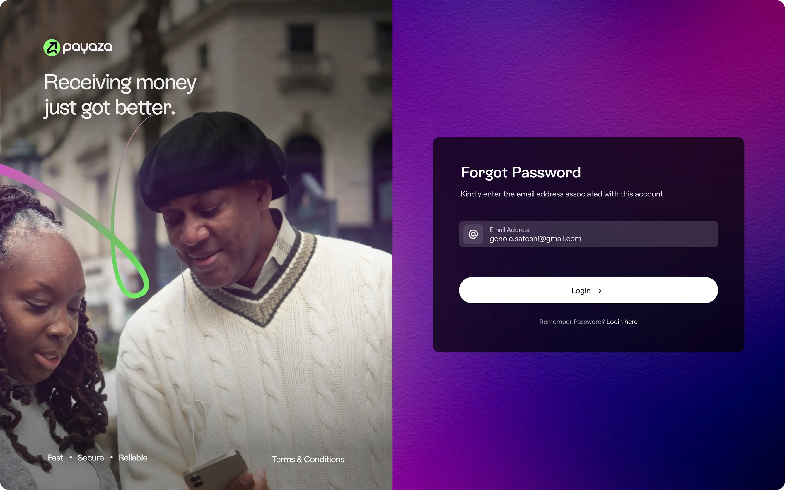
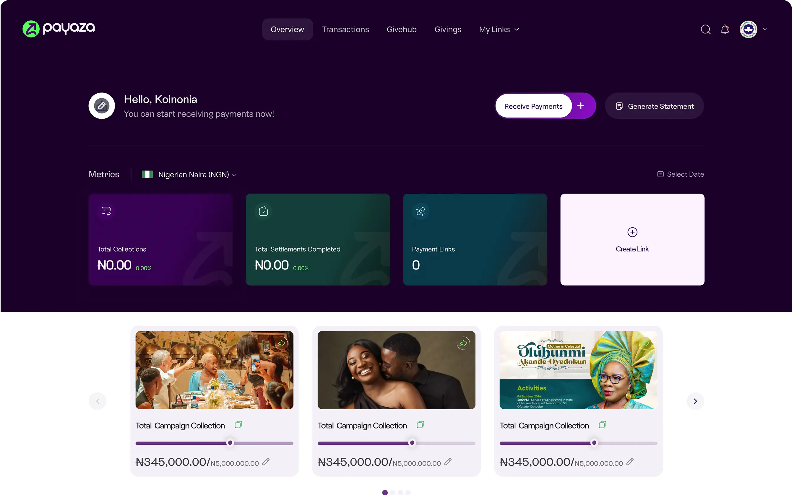
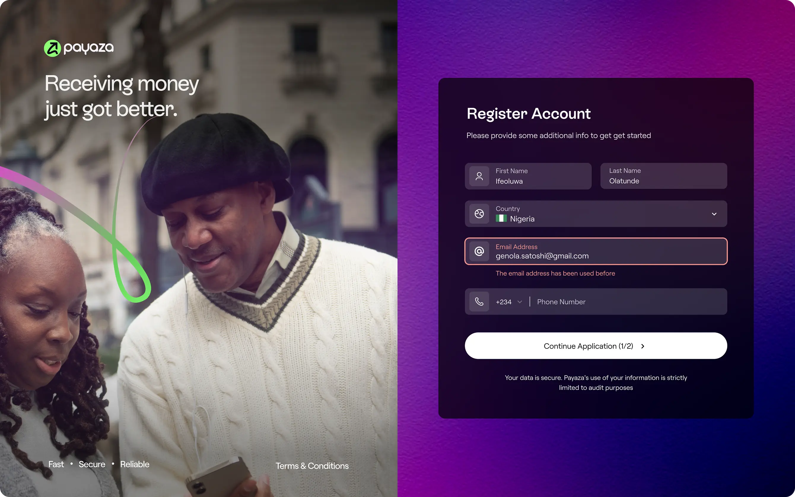
The Design A single sign-up screen with intentional scope. Name, email, country, business name, business identifier, password, OTP. Country drives the compliance profile. Business identifier drives the URL slug. OTP closes the loop on email validity. Everything else moves into the KYB flow, where it belongs. The user lands on a working dashboard with a generated link, ready to share, within minutes of sign-up.
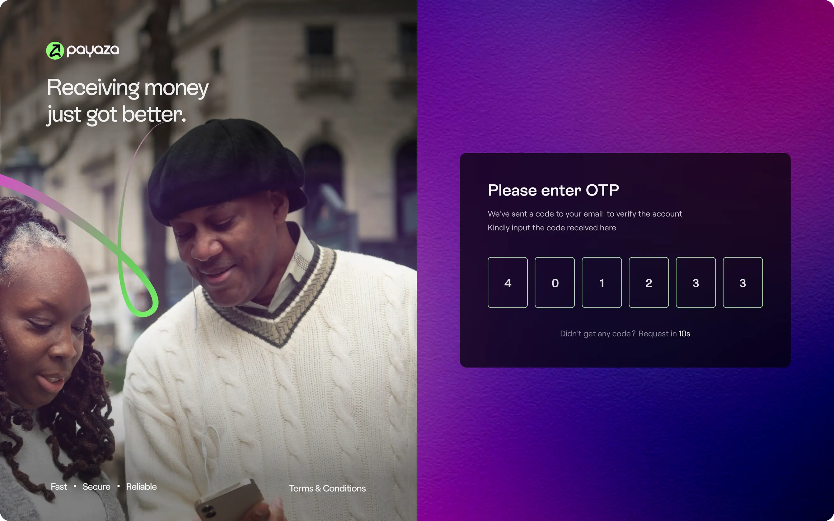
01 / 06
Payaza Give Sign-up screen
01Payaza Give Sign-up screen
OTP Verification Screen
02OTP Verification Screen
Payaza Give Sign-up screen
03Payaza Give Sign-up screen
First-time Dashboard State
04First-time Dashboard State
Onboarding
05Onboarding
Freelancer onboarding
06Freelancer onboarding
Decision 2:

Treat the link, not the account, as the atomic unit

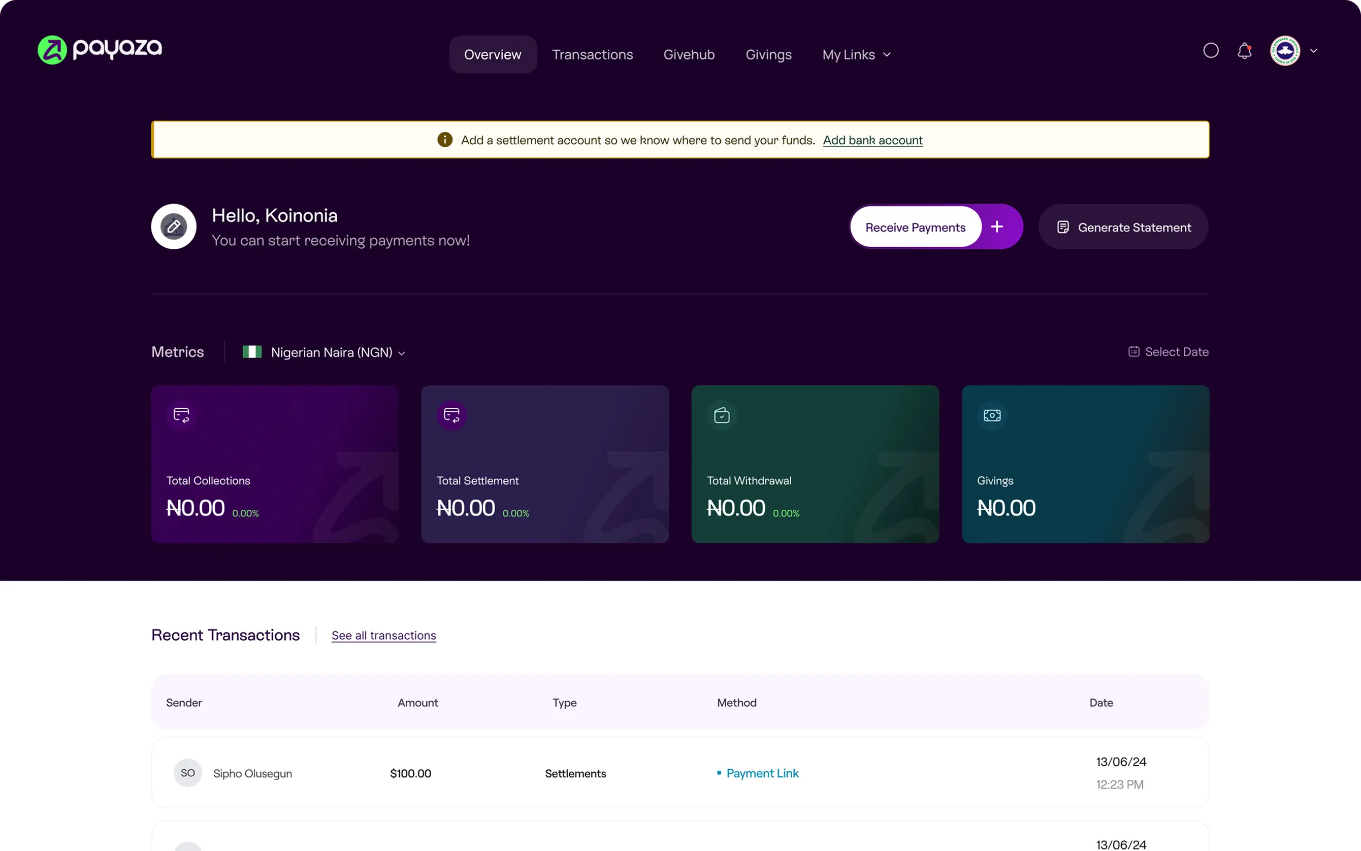
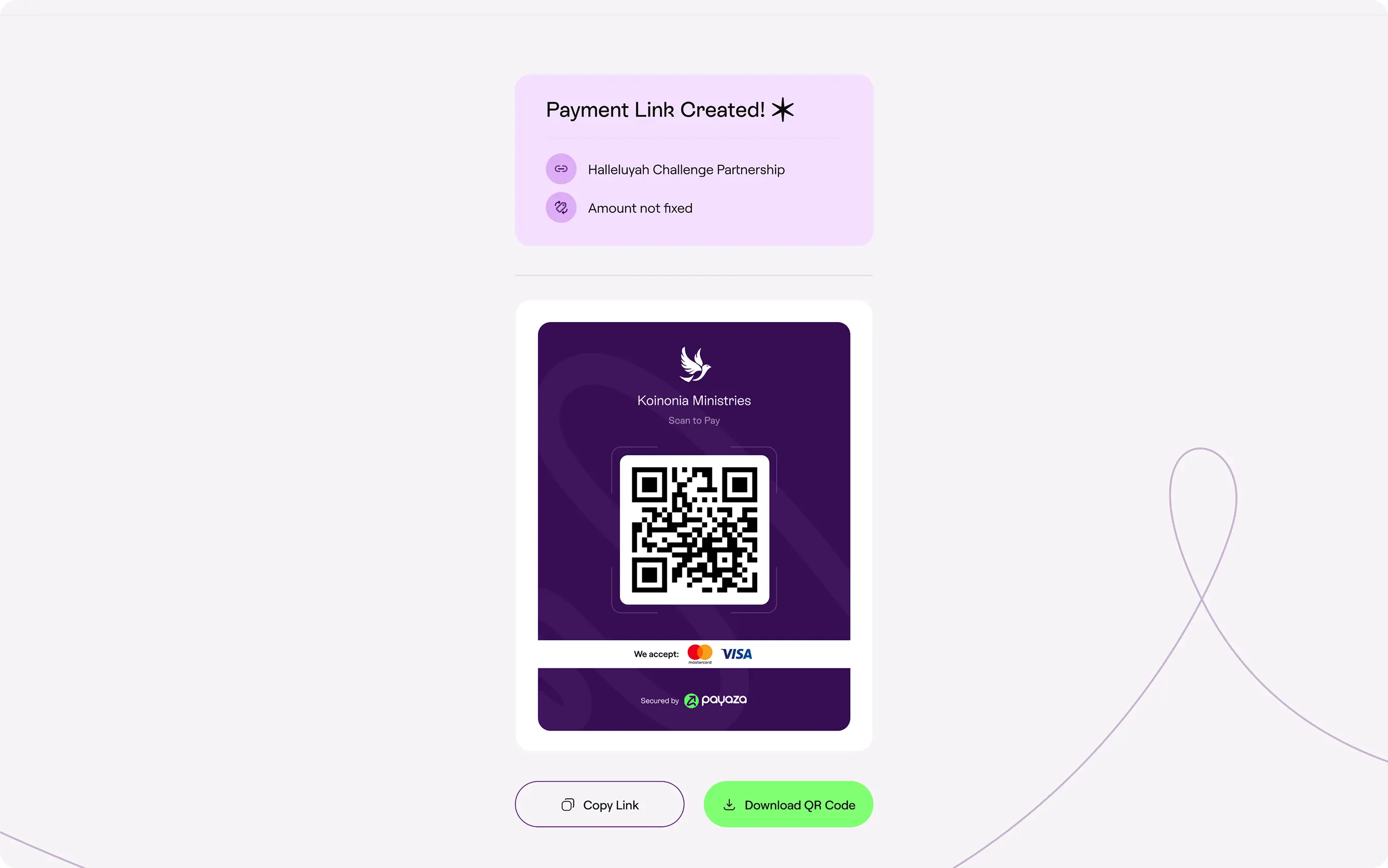
The product’s centre of gravity sat on the link rather than the account. The dashboard, the QR code, the embed, the shareable URL are not separate features. They are the same payment page expressed in four distribution contexts.

This decision was structural, not cosmetic. The data model put the link at the centre and let the account hang off it, rather than the other way around. The consequence was that customisation propagates automatically. The recipient never has to think about propagation, because propagation isn’t a feature. It’s a property of the model.

Recipients didn’t talk about “managing their Payaza account.” They talked about “the link” they shared. The product respected that mental model in the architecture.

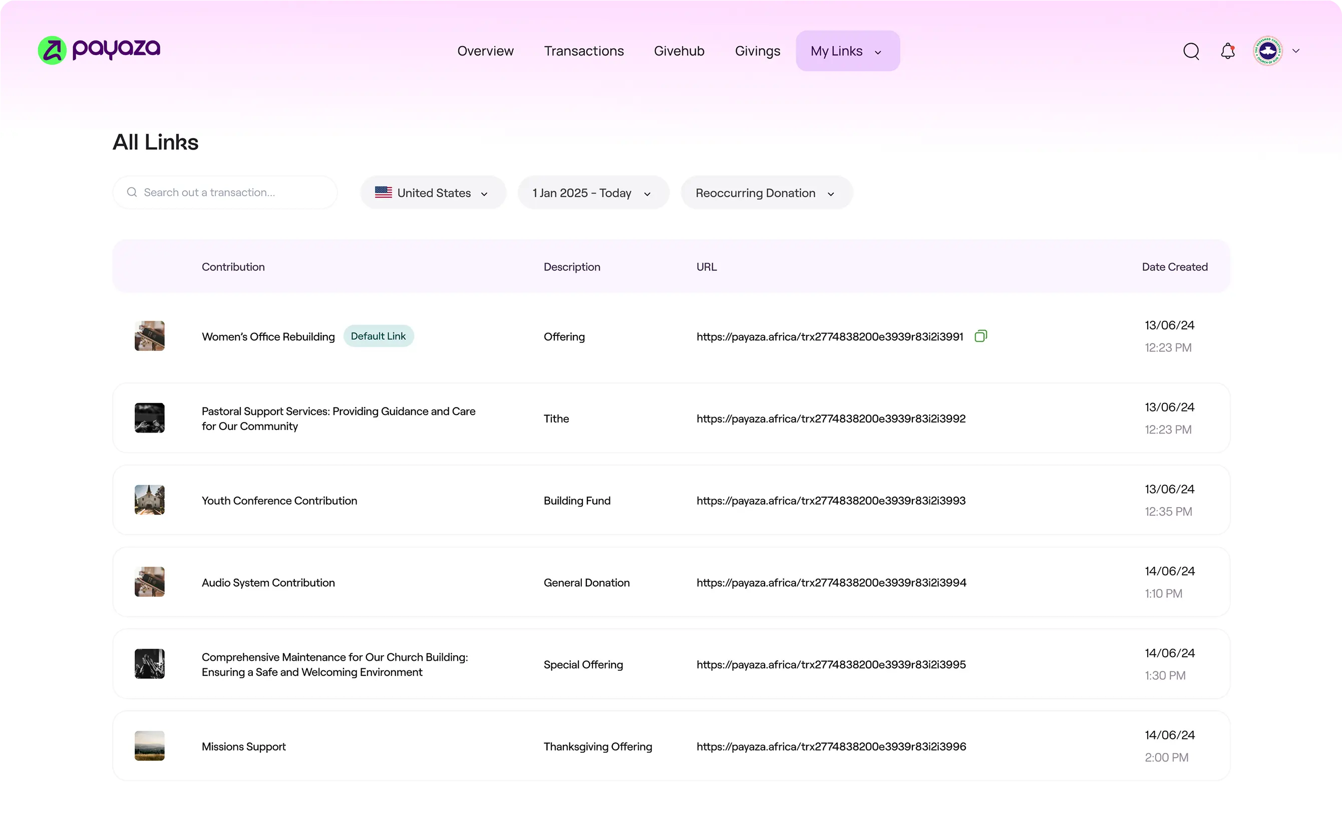
The Design A single “Create Link” action on the dashboard generates four artefacts simultaneously: the live URL, a dynamic QR code, an embed snippet, and a copyable share string. All four point to the same payment page. Update the logo once, and the page behind the link, the QR on the flyer, the embed on the website, and the bio link in Instagram all reflect it.

01 / 06
Payaza Give Dashboard
01Payaza Give Dashboard
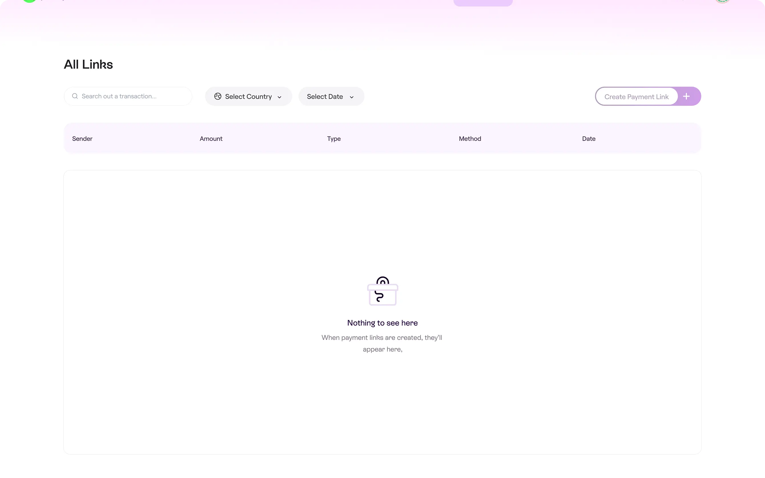
All Links Page
02All Links Page
Close-Up Of The Link Creation Panel
03Close-Up Of The Link Creation Panel
Payment Flow
04Payment Flow
All Links
05All Links
Close-Up Of The Link Creation Panel
06Close-Up Of The Link Creation Panel
Decision 3:

Layer the branded page with sensible defaults

The design question was what to expose and what to hold. Logo, copy, and background carry the recipient’s identity, so they got exposed. Layout, typography, button placement, and field order carry the donor’s expectation of what a checkout looks like, so they stayed held. The 2x2 from synthesis (donor confidence vs. recipient control) was the framework that decided each surface element.

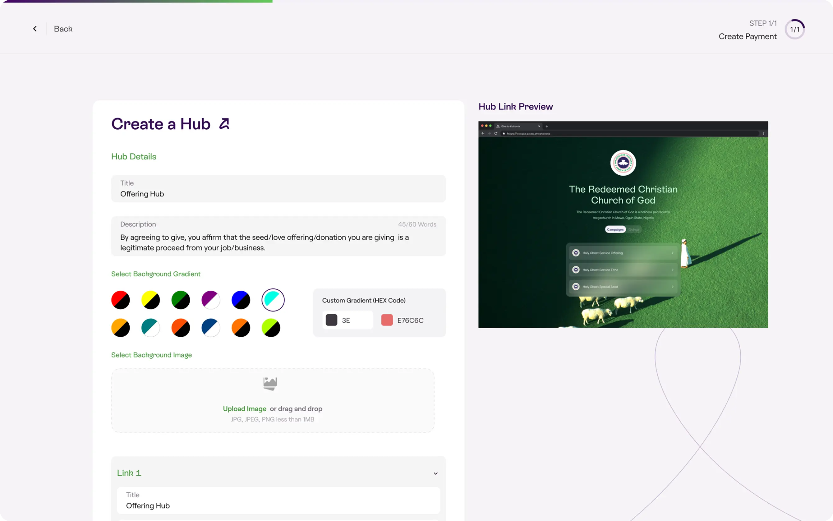
The Design A customisation panel with four controls: logo upload, sub-heading text, background image, and background gradient. A real-time preview shows changes before publishing. After save, a modal surfaces the shareable URL. The moment of completion is also the moment of distribution, by design.

The default state, before any customisation, is already functional. Usable, shareable, not embarrassing. The recipient adds polish on their own timeline.

01 / 03
Customisation Panel
01Customisation Panel
Links Created
02Links Created
All Links Page
03All Links Page
Decision 4:

Design the donor surface as a checkout, not a donation form

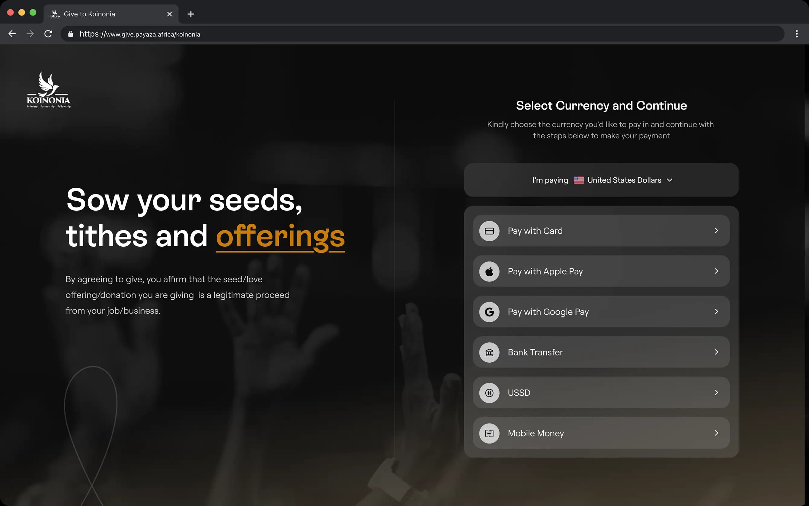
The donor surface was designed against an e-commerce benchmark rather than a donation benchmark. The heuristic evaluation in Track 1 set the bar. Wallet-first, single-context, inline validation, no redirects.

The decision to lead with wallets cost us something on the recipient side. Recipients sometimes asked for card to be the prominent option because that’s what they were used to. The decision held because the data from the comparative teardown was unambiguous: wallet-first surfaces outperformed card-first surfaces across every product we benchmarked.

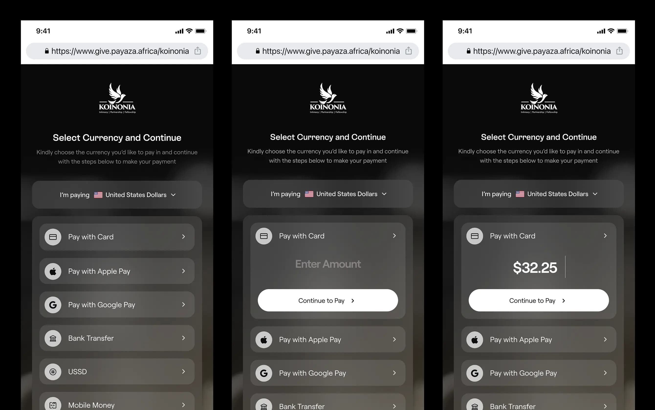
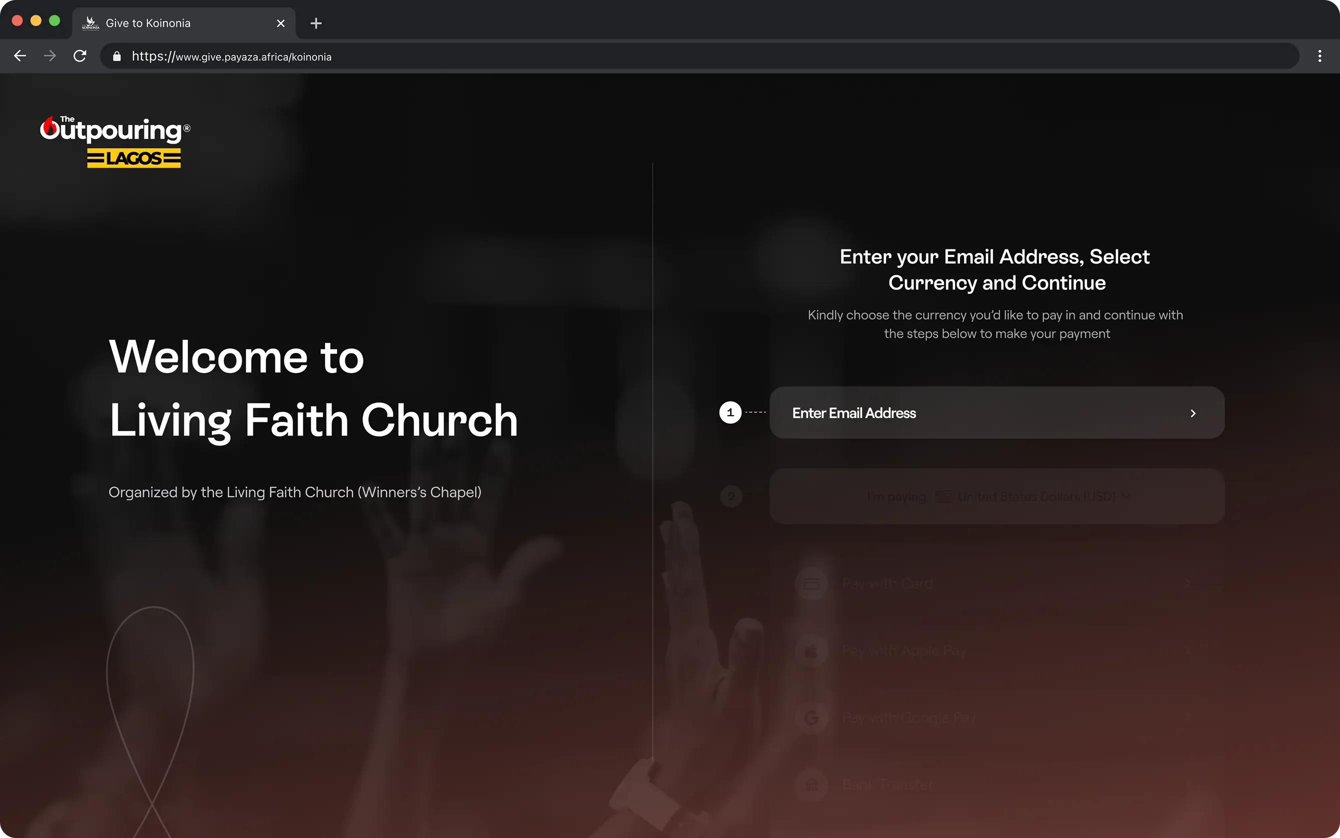
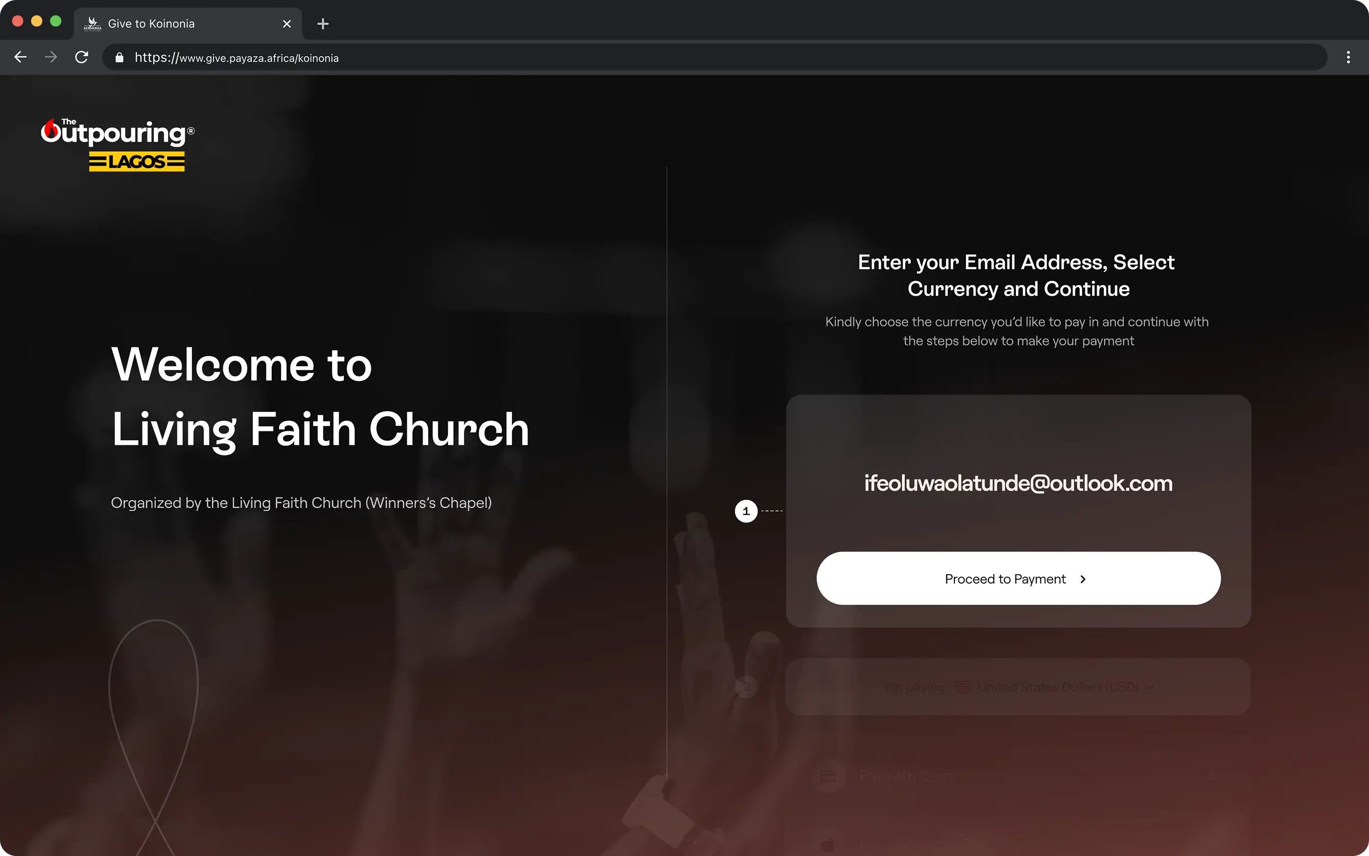
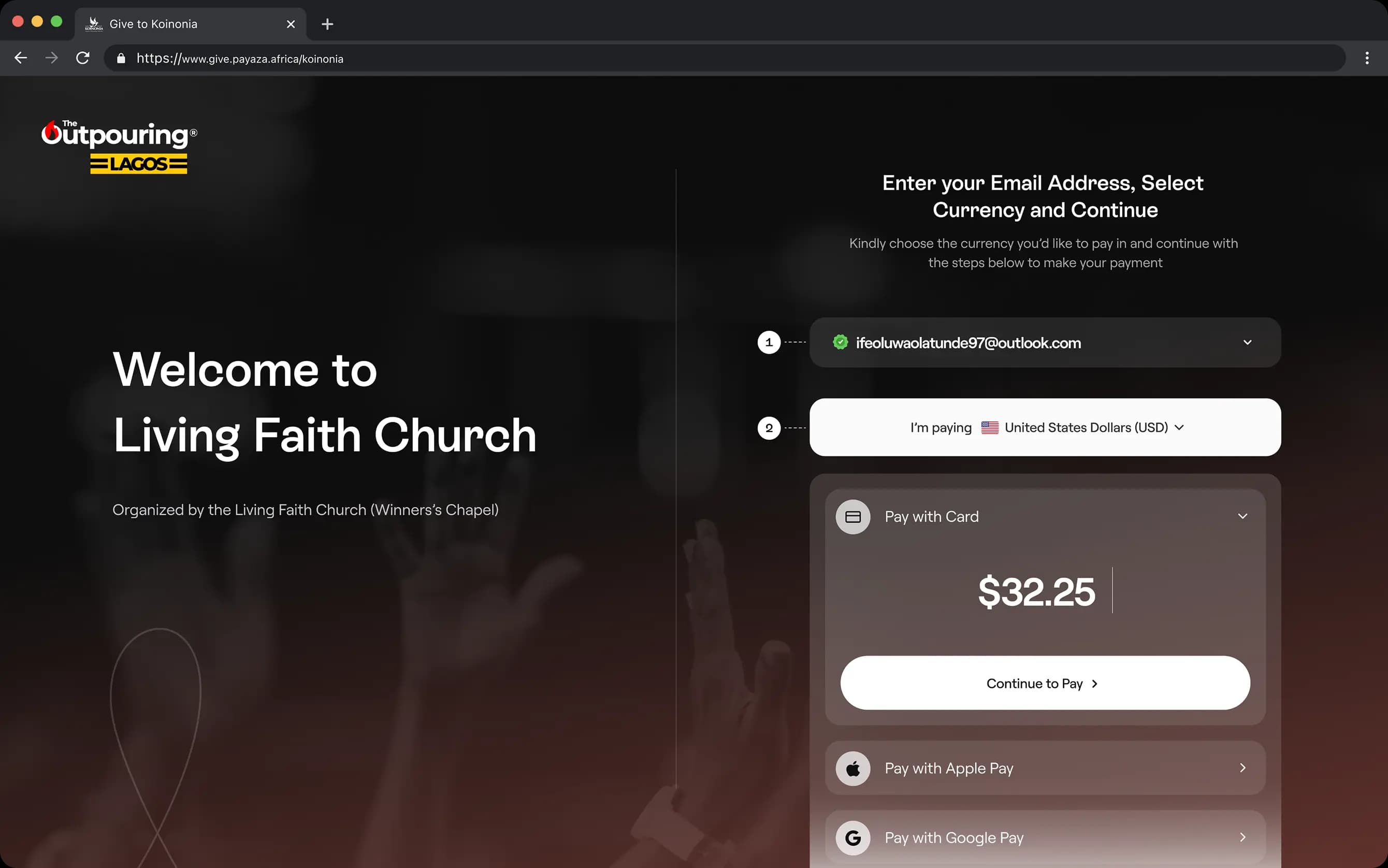
The Design Apple Pay or Google Pay appears as the first option on supported devices, ahead of card entry. Card entry uses the patterns donors recognise from any well-designed checkout: autofill, smart field validation, inline errors that don’t break the flow. Currency selection happens in one place. International payment methods surface based on the donor’s region, not the recipient’s. The entire flow lives on a single page, with no redirects.

01 / 04
Mobile donor Checkout
01Mobile donor Checkout
Checkout Flow
02Checkout Flow
Enter Email
03Enter Email
USD Payment
04USD Payment
Decision 5:

Treat settlement currency as a first-class choice

The journey mapping in Track 3 surfaced that currency decisions were being asked of donors who had no context, and of recipients in moments where they had no headspace. The fix was to move the decision to the place where the recipient had both: at setup, and at any quiet moment after.

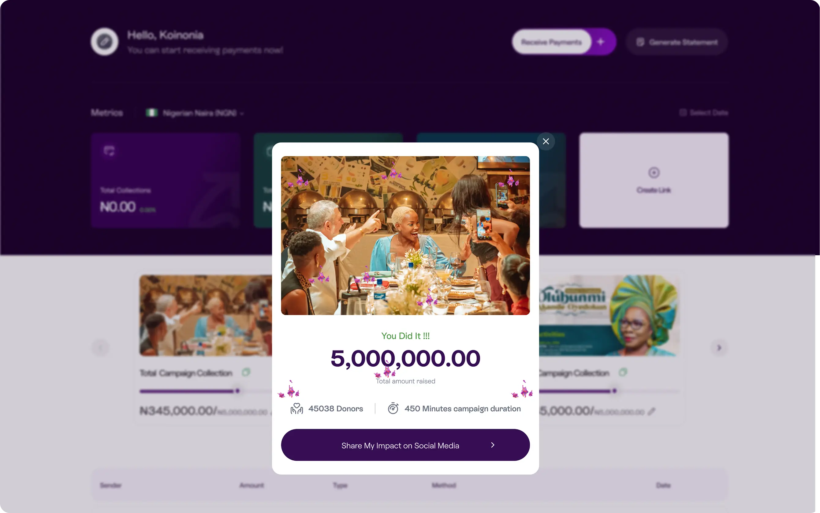
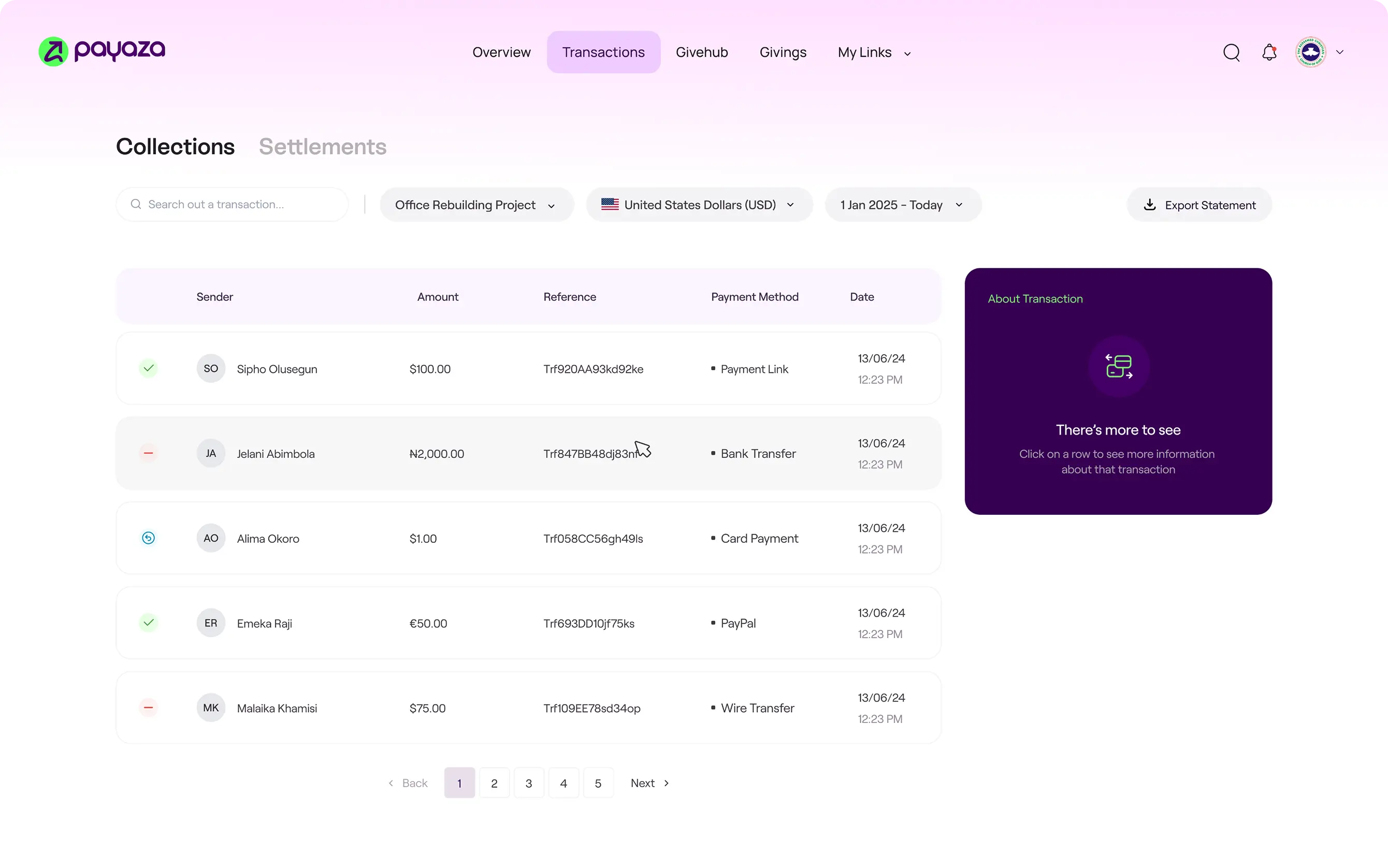
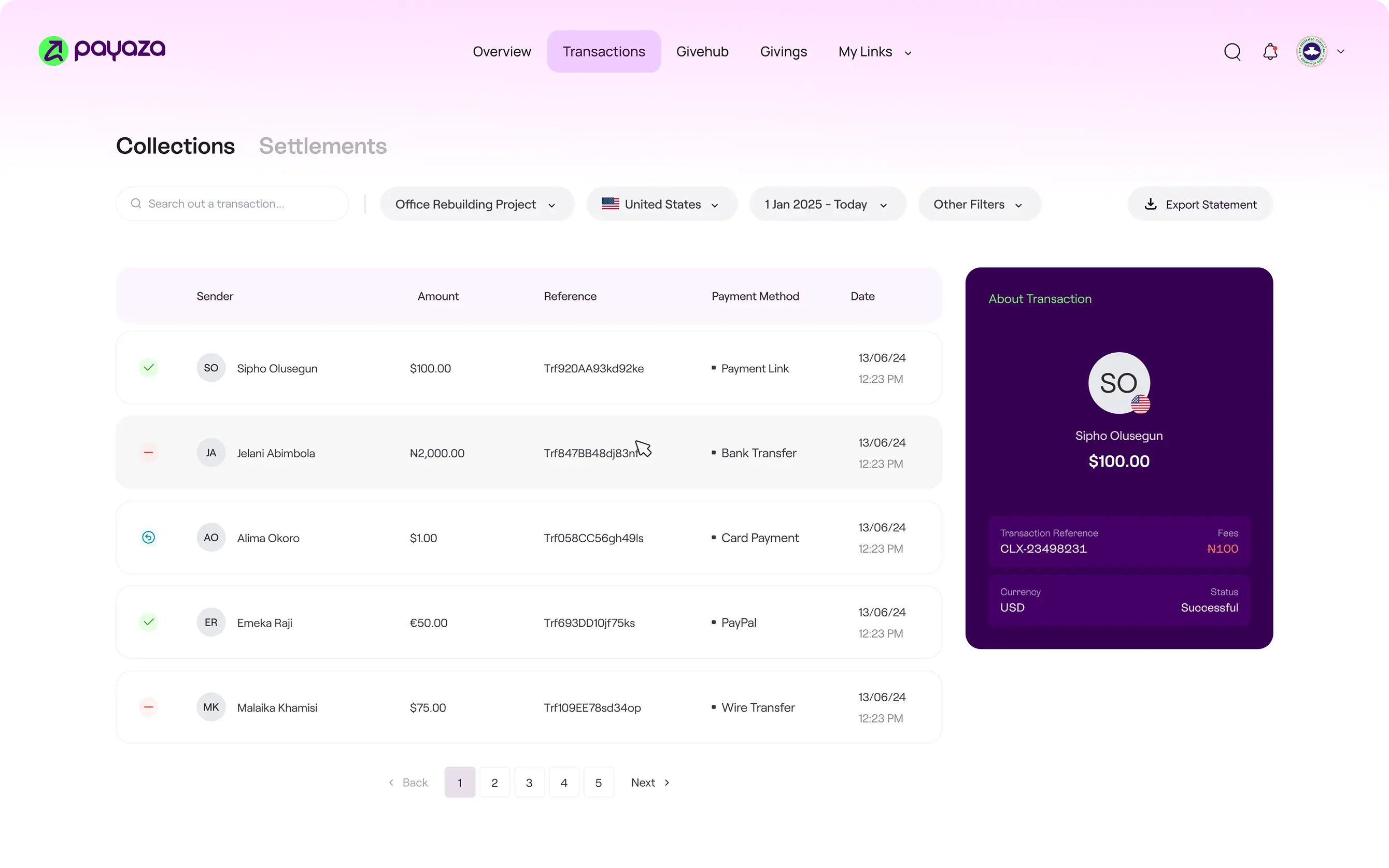
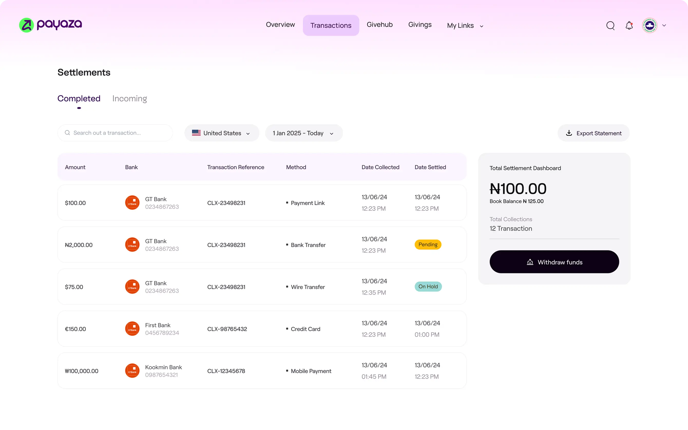
The Design Settlement currency is exposed at the dashboard level, not buried in settings. The recipient picks USD or their local currency, and can switch at any time. The product absorbs the back-office complexity (multi-currency reconciliation, FX margin, settlement timing across rails) so the recipient sees a toggle and nothing more.

01 / 04
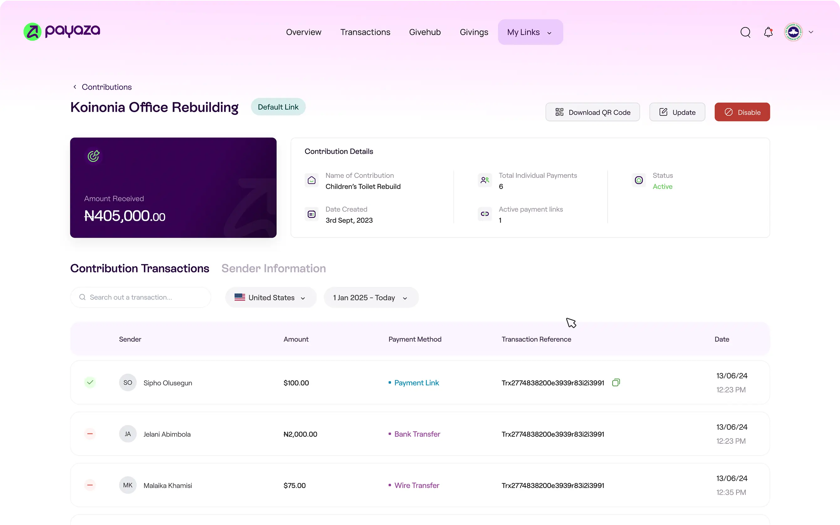
Collections Page
01Collections Page
Collection Details Page
02Collection Details Page
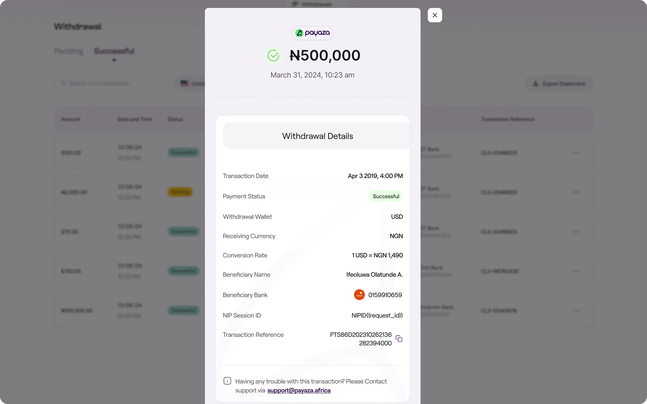
Settlement Details Page
03Settlement Details Page
Withdrawal Details
04Withdrawal Details
In ConclusionThe End

Payaza Give is a small product carrying a large thesis.

Contribution tooling has been mis-shelved for two decades. It sits in the “nonprofit software” category, but the moment that decides whether a contribution happens is a checkout moment, and it should be designed against the conventions of consumer commerce.

Payaza Give moved the surface from one category to the other. The link, not the account, became the atomic unit. The wallet, not the card form, led the checkout. The recipient’s brand, not the platform’s, framed the page. None of these are aesthetic decisions. Each is a structural bet on what kind of product this is.

The bet held. The patterns it established propagated outward into adjacent Payaza products in the quarters that followed.

The deeper claim is about where the contribution economy is going. Charitable giving, creator support, community fundraising, and recurring patronage are converging into one behaviour: people sending money to people, across borders, on phones. The products that win this category won’t be the ones with the most donor management features. They’ll be the ones with the lowest-friction surface and the highest-trust brand.

Payaza Give is the collection layer for that bet. Part 2 is the trust layer underneath it.